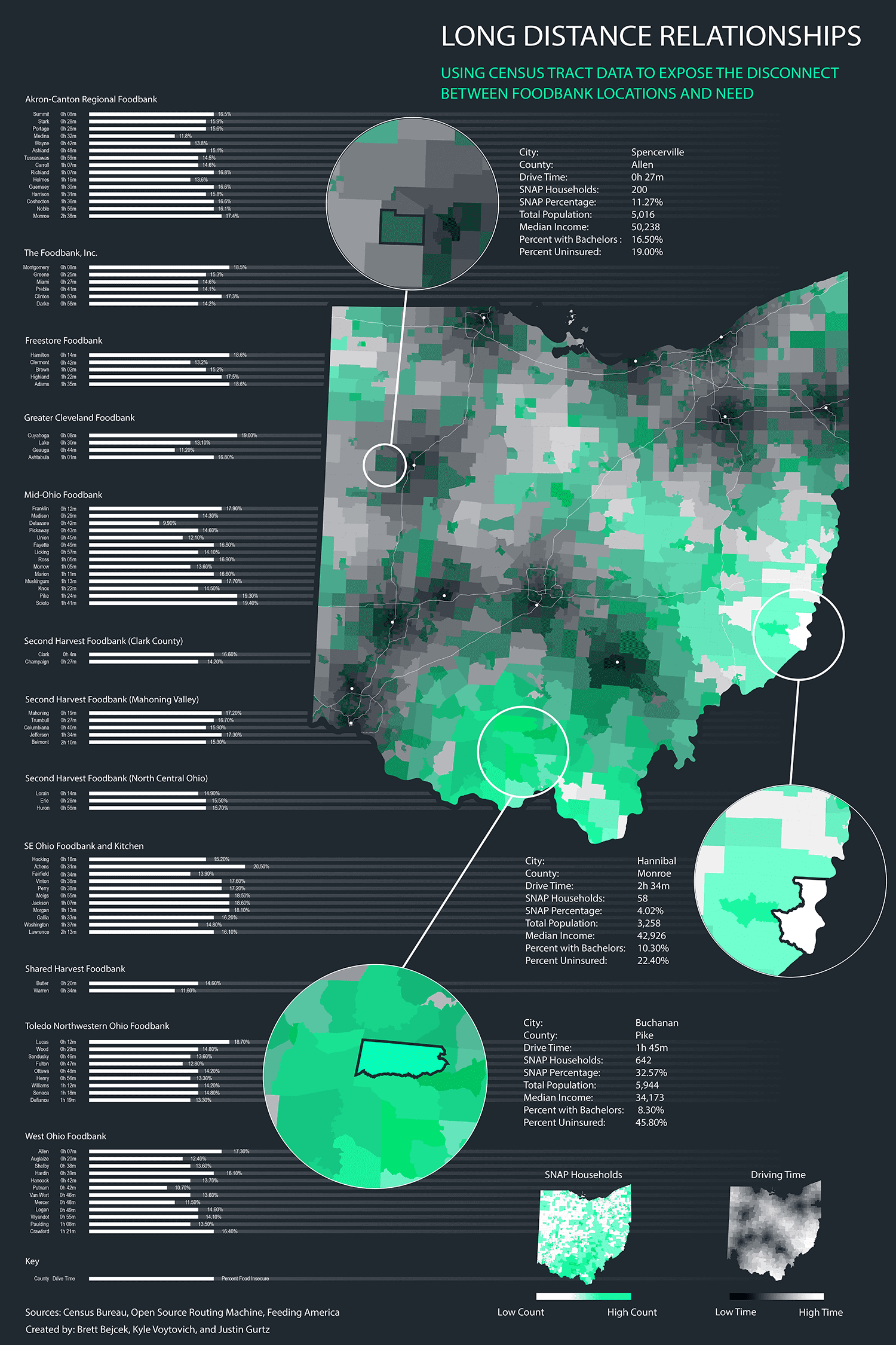
This visualization, second place winner, shows the disparity between access and need for food banks in Ohio. It was created by overlaying two different sources of data to see emerging trends. To create the drive time data, first, a list of census tracts with center coordinates were produced. Then Python code was run to calculate driving time from that center coordinate to the nearest foodbank. This was achieved by utilizing Open Source Routing Machine. Next, we received SNAP data about food insecurity from the Census. Our final step was overlaying these two data sources in QGIS to produce a meaningful visualization.
