I wasn't a big fan of my old website. It sort of looked like I was just learning how to use the computer and someone had accidentally left caps lock on.


Seriously?! Had I never heard of differing styles of typography? That's crazy sauce to me. And to top it all off, this was a single page website with no depth at all.
And it wasn't just the design that was bothersome to me. It was the entire architecture and purpose. I designed this website at a point in time when I was just getting to know HTML/CSS/JS. I dumped all my files into a bucket, pointed an IP at it, and called it a day.
Nevertheless, at least I was smart enough to realize things had to change. I had three main goals for this site:
-
Create a flow that engages the reader
-
Redesign infrastructure to be fast
-
Design interactive components to delight reader
Going with the flow
One of my first exercises to creating my new website was imaging who was my end user. I did a lot of mind mapping and tossed a lot of ideas around.

I soon began to realize that this website was as much for me as anyone. What I ended up with was the following vision statement:
My website is a place where I can show off my latest work and write about topics I care about.
That sounds less than profound, but in the moment it was profound for me. I wanted a place to call my own. I wanted a space where I could gather my thoughts so they could receive feedback, so I could begin to challenge my beliefs and values, and ultimately grow as a person. I think there is where the profundity lie.
After determining this, I began to do a whole bunch of wireframes.


Well it was clear that I hadn't earned my degree in design quite yet. But I was throwing things down on paper. Sending them over to friends and asking for their thoughts. Design isn't a polished product. It's a journey. Having these wireframes, as basic as they may be, allowed me to move onto my next steps of working on infrastructure.
Infrastructure Shenanigans
Like I mentioned before, I was coming from the most static website possible. To make a code change, I had to manually go into the existing copy in the cloud and change it. I had no record of truth. I had no way to continuously deploy. None of that. At all. Then along comes Gatsby, a static site generator, and Netlify and boom, this section could already be over.
These two coupled together allowed me to:
-
Build a blazin' fast site
-
Continuously deploy via integration with Github
-
Use a JAM Stack to write content faster than ever before.
Sounds like a win, am I right?
As Gatsby and actually React was new to me at this point in time, I followed all the tutorials religiously. This allowed me to really understand what I was getting myself into. Also at this point in time I was realizing that I wanted to have a lot of live data involved in this site.
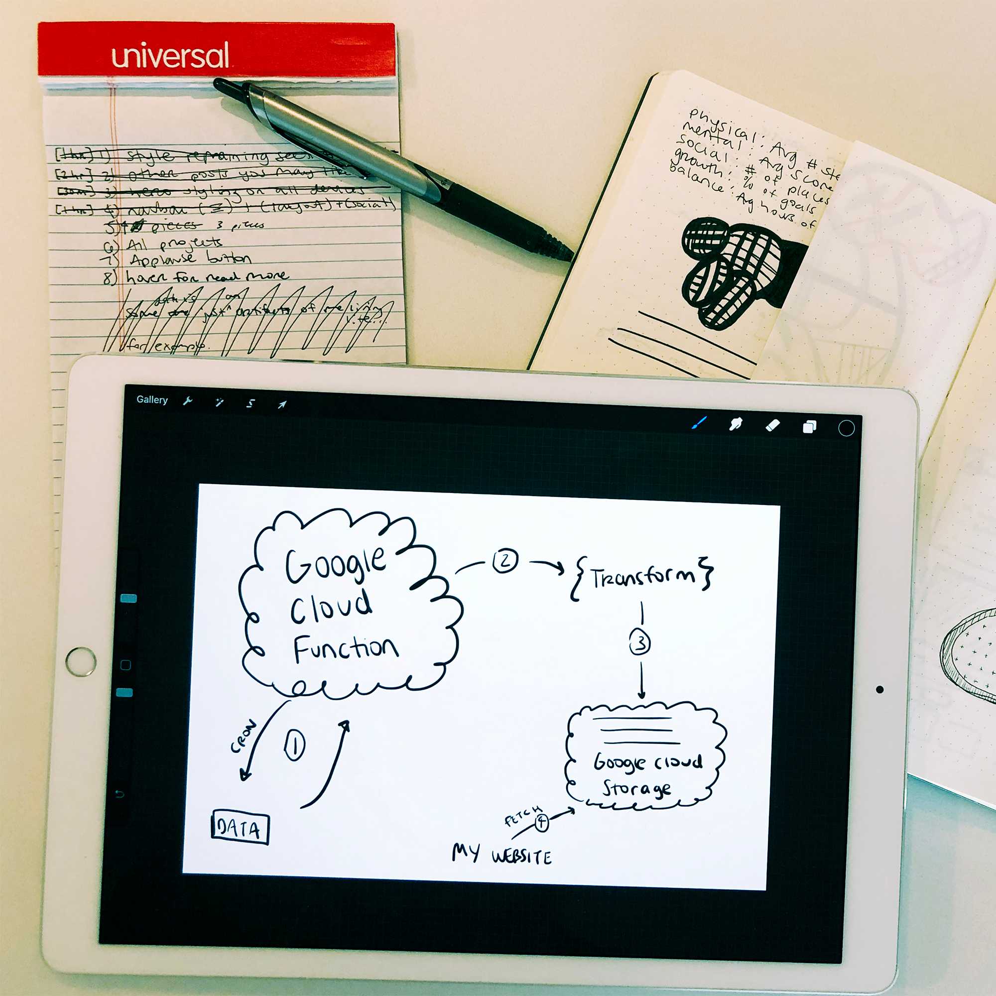
After a lot of research on how I could do everything I wanted while getting by on a free-tier, I decided on the following architecture:

I would schedule a CRON job every hour to fetch data from some services, mash it all together, and then leave it as easily digestible files on Google Cloud Storage and fetch it from the client side. Pretty exciting stuff!
Designing Interactive Components
I wanted to try new things, have live data flowing around, and be a visual storyteller. I wanted some of these widgets to totally fail and some to be really really cool.
The main purpose of these sections were to connect with the reader. I wanted to share things that were going on in my life so the reader felt like they were right beside me, like they part of my life even though they could be thousand of miles away. I began to brainstorm with what I could collect data on in my life that could be part of these shared experiences. I ended up with a list of about 100 or so different ideas that I distilled down into some themes:
-
Location data or extrapolation of location data
-
Physical data (steps, heart rate, etc.)
-
Mental data (I mood track regularly)
-
Sleep data
So I took this list and figured out a handful of ways to time them into my site, namely the hero on landing page and the stats landing page. For the sake of time and your attention span, let's just dive into the hero banner.
I wanted to share where I currently was adventuring around with a map drawn in the background. I didn't want it to be creepy like "Brett is in this coffeeshop on the second floor 2.4 milliseconds ago." But I also didn't want it to just give me the city, because I spend an awful lot of time in Seattle these days and always saying "Seattle, WA" seemed boring to me.

I quickly got to work coding a Python script and found a beautiful package called Nominatim. I was able to provide a lat, lon and have it output a neighborhood. Brilliant!
From there, I took the coordinates, obfuscated them to make sure I wasn't giving away my actual location at any point, and made a call to a service that returns a png of the area. Sounds simple enough right? Well, I am a pretty particular person and actually wanted this to have an effect where it gets drawn in the background. So I then had to have my script use OpenCV to vectorize it with some rather manual settings. When all this was said and done, I had an svg that was accessible via Google Cloud Storage. Success!
Putting it all together
"But wait Brett, you can't just show us some starting point wireframes and your cloud architecture and expect this article to be over can you?" Look I am not happy about it either, but the truth of the matter is, if I wanted to show my design process, that would be like a thousand pictures long. I have been working on this up in my head for quite some time.


Every single day, I wake up and could change a million things about how I design or how I code. If I get so fixated on that though, I never ship anything. I am proud of the work I have done here. Even though I am pretty darn sure that in another two years, I will be writing a blog about how this website is the worst. Life is about iteration. I am proud that this website is a step along my journey.